Get Revising Responsive Website
Responsive site redesign and study tools that would work across a variety of device sizes.
Role
Lead Designer
Industry
Education
Year
2015
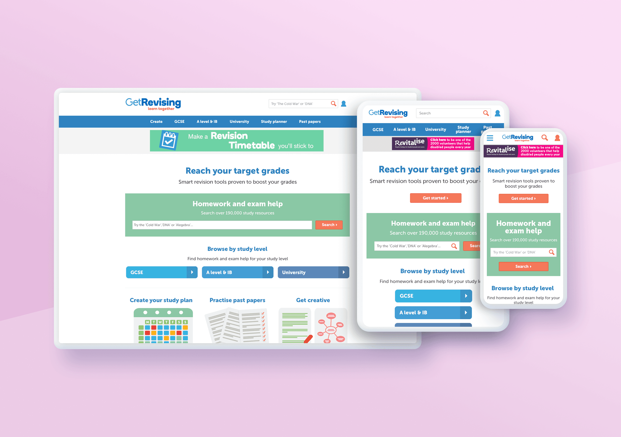


Defining the breakpoints
Since the new site had to be responsive across a wide range of devices, one of my key tasks was defining the page structure and breakpoints. Our goal was to minimize the number of breakpoints while ensuring that the content maintained its integrity and readability across different screen sizes.
I decided on three main breakpoints:
Small: For mobile phones
Medium: For tablets
Large: For laptops and desktops
Using data on the most common mobile and tablet screen sizes, I mapped out the page layouts for each breakpoint, ensuring that the design would be flexible enough to work across devices.

Wireframes
Building on the user journeys we had already mapped out, I began sketching basic wireframe concepts on a whiteboard to visualize the page layouts. I reviewed the existing elements on each page and identified new ones that would improve user experience, such as showing related study resources within the topic being viewed.
The goal was to ensure users could quickly navigate to resources, engage with them effortlessly, and, once they completed a task, easily find additional related resources within Get Revising.
There were over 10 different page templates to create, including the homepage, landing page, category page, resource templates, search results, registration and account pages, and the navigation menu. Each page required small, medium, and large wireframes to accommodate different screen sizes.
Content and elements
Since all the pages being designed were based on existing ones, we had a solid understanding of which elements to retain, which to redesign, and which new elements to introduce. Collaborating closely with the product owner, we were able to define the content for several key areas, including identifying the three promotional elements on the homepage and determining the types of content they would feature.
To ensure accuracy and realism in the wireframes, I incorporated as much real content as possible. For any existing copy on the site, I used the actual text in the wireframes. For content that hadn’t yet been created, I added placeholder text, ensuring the designs were based on real-world scenarios and would feel cohesive once the content was finalised.
Detailed specifications
To ensure clarity for the external developers, these wireframes were created in as much detail as possible. Along with the wireframes, I produced a detailed specification document that outlined the interactions and descriptions for each element, as well as how the pages should flow.


Before and After
Below are some before and after slideshow of some of the desktop pages. On the left is the previous design and on the right is the new design.


View more projects
UX Design | User Research | E-Commerce
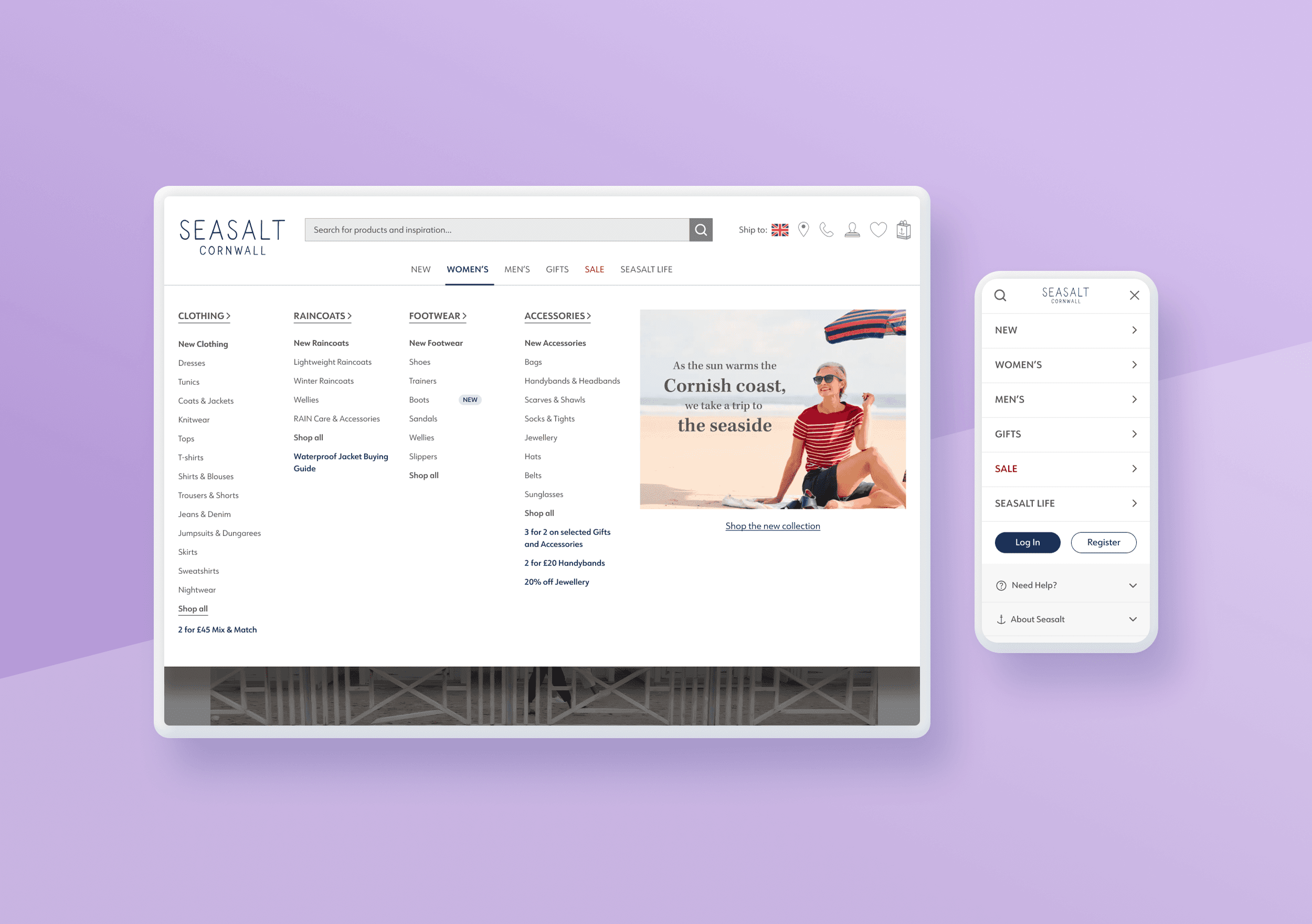
Optimising Seasalt’s Navigation & IA
Revamping User Experience Through Simplified Navigation and Improved Usability
UX Design | User Research | Community
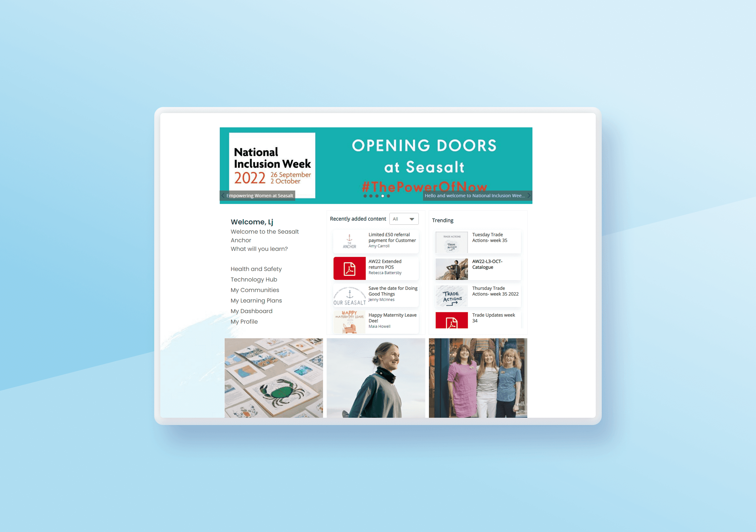
Transforming Fuse: A UX Optimisation of Seasalt’s Intranet
Improving usability, engagement, and brand alignment to enhance the employee experience.
UX/UI Design | User Research | Charity
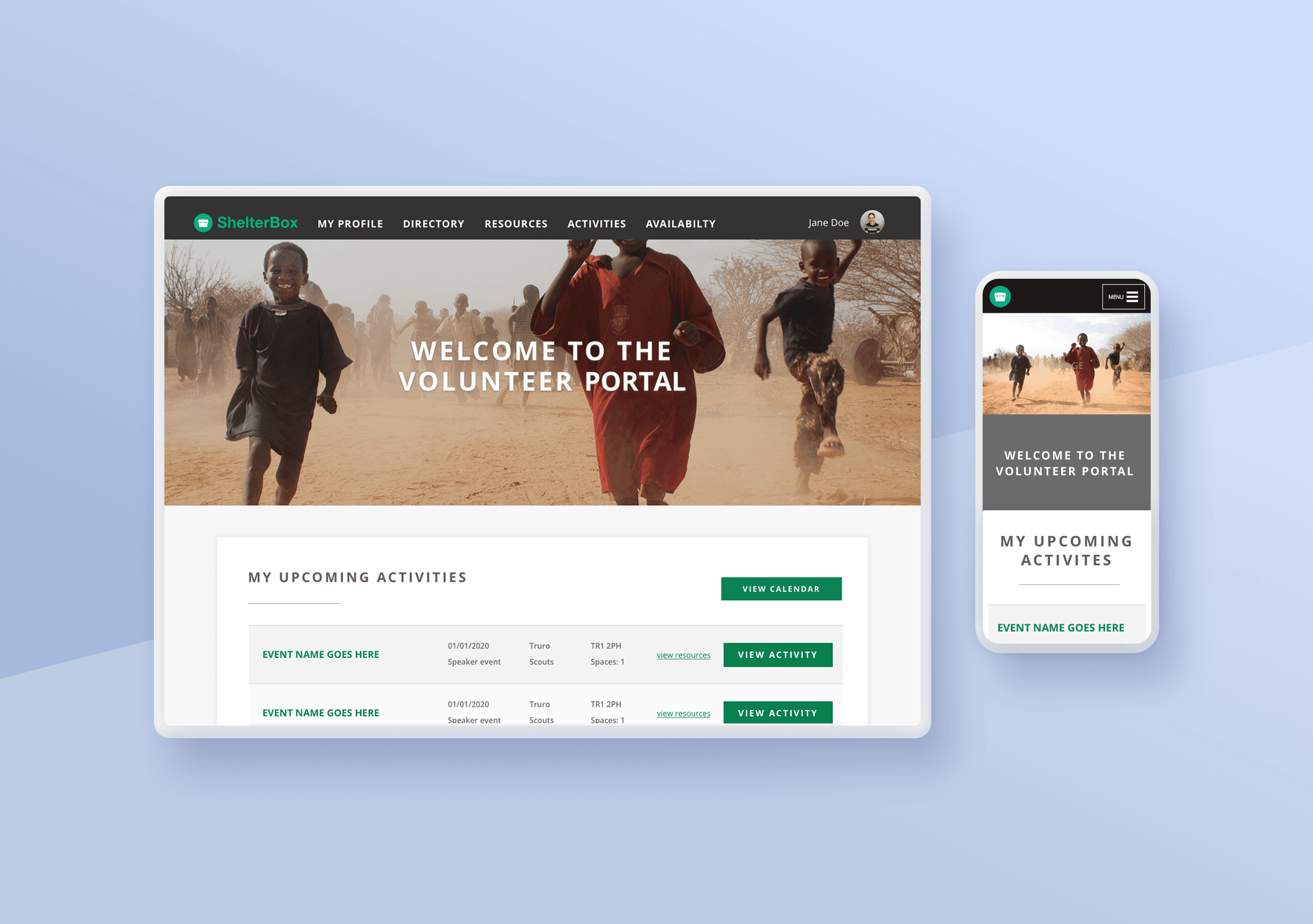
ShelterBox Volunteer Portal Redesign
Redesign of the volunteers portal taking a strong user led approach.