Overview
The Seasalt Cornwall website redesign was all about simplifying the navigation to make the shopping experience more intuitive and aligned with the brand’s core values of sustainability and craftsmanship.
As the Senior UX Designer, I worked closely with cross-functional teams and conducted user testing to create a more user-friendly structure. The result was a streamlined design that improved usability, boosted engagement, and enhanced overall performance, helping to drive better conversion rates and ensuring the site better met both user needs and business goals.
Project Background
Why Redesign the Navigation?
The development team was already rebuilding the navigation module, presenting an opportunity to rethink its design. At the same time, the business wanted to separate men’s and women’s categories, which required changes to the structure.
We also knew from previous research that the existing navigation had usability issues—both in its structure and design. This was the perfect chance to tackle those problems while improving the overall information architecture.
Key objectives
The key objectives for this project were to increase conversions by making key product categories such as Men’s more discoverable, reduce bounce rates with an intuitive navigation flow, and improve site performance by developing a cleaner, simpler navigation menu.

To ensure a well-informed and user-centred approach, I wanted to ensure we leveraged all available resources, combining research, best practices, and usability testing. The process included:
Competitor Research – Analysed similar brands to identify common design patterns and best practices for navigation structures.
Contentsquare Analysis – Used behavioural data to understand how users interacted with the existing navigation and identify pain points.
E-commerce UX Best Practices – Applied insights from Baymard Institute and Nielsen Norman Group to align with industry standards.
User Research – Conducted tree testing and card sorting on both the old and new structures to understand the information architecture.
Mockups & Prototyping – Created high-fidelity designs to visualise the new structure and ensure seamless user flow.
Usability Testing – Evaluated the new design’s performance through user testing, identifying areas for refinement.
This iterative approach ensured that decisions were data-driven, user-focused, and aligned with industry best practices.
Overview
The Seasalt Cornwall website redesign was all about simplifying the navigation to make the shopping experience more intuitive and aligned with the brand’s core values of sustainability and craftsmanship.
As the Senior UX Designer, I worked closely with cross-functional teams and conducted user testing to create a more user-friendly structure. The result was a streamlined design that improved usability, boosted engagement, and enhanced overall performance, helping to drive better conversion rates and ensuring the site better met both user needs and business goals.
Project Background
Why Redesign the Navigation?
The development team was already rebuilding the navigation module, presenting an opportunity to rethink its design. At the same time, the business wanted to separate men’s and women’s categories, which required changes to the structure.
We also knew from previous research that the existing navigation had usability issues—both in its structure and design. This was the perfect chance to tackle those problems while improving the overall information architecture.
Key objectives
The key objectives for this project were to increase conversions by making key product categories such as Men’s more discoverable, reduce bounce rates with an intuitive navigation flow, and improve site performance by developing a cleaner, simpler navigation menu.
To ensure a well-informed and user-centred approach, I wanted to ensure we leveraged all available resources, combining research, best practices, and usability testing. The process included:
Competitor Research – Analysed similar brands to identify common design patterns and best practices for navigation structures.
Contentsquare Analysis – Used behavioural data to understand how users interacted with the existing navigation and identify pain points.
E-commerce UX Best Practices – Applied insights from Baymard Institute and Nielsen Norman Group to align with industry standards.
User Research – Conducted tree testing and card sorting on both the old and new structures to understand the information architecture.
Mockups & Prototyping – Created high-fidelity designs to visualise the new structure and ensure seamless user flow.
Usability Testing – Evaluated the new design’s performance through user testing, identifying areas for refinement.
This iterative approach ensured that decisions were data-driven, user-focused, and aligned with industry best practices.
Research Process
To inform design decisions, I initiated both qualitative and quantitative research to get a well-rounded picture of how the navigation was currently performing.
Behavioural Data & Insights
We analysed behavioural data using Contentsquare, a digital analytics tool to understand how users interacted with the existing navigation. I focused on mobile behaviour, while my colleague examined desktop interactions. We assessed each section of the menu, along with individual categories and links, to identify key engagement patterns.
The analysis measured user interaction with the navigation menu, revealing key trends in engagement and usability.
High-performing menu items included ‘New,’ ‘Sale,’ and ‘Clothing,’ which had the highest click rates.
Despite its lower priority, the Men’s category outperformed Accessories, Footwear, and Gifts & Home, showing strong user interest.
Areas of low engagement included ‘Seasalt Life,’ which had the lowest clicks and highest hesitation time, indicating unclear content.
Subheading confusion was evident, with users mistakenly trying to click on category titles.
Special offer links, like ‘2 for £45,’ were visible but received fewer clicks than expected.
Filtering trends showed ‘Petite’ as the most popular fit filter, except in the ‘Rain’ category, where ‘Tall’ had higher engagement.
MMAs (Mega Menu Ads) performed best in the ‘Sale’ menu, aligning with seasonal promotions.
‘Shop by Collection’ saw hesitation, suggesting users were unsure of its purpose.
These insights helped identify opportunities to refine navigation labels, improve clarity, and enhance user engagement.
Below are some examples of the behavioural data on mobile from Contentsquare:

Tree Testing the Current Navigation Structure
The goal of this research was to identify usability issues and gather feedback on the information architecture of the navigation. I proposed two studies: one on the existing structure to uncover any issues and highlight strengths, and another on a revised structure featuring a women’s and men’s category split. This would validate our assumptions for the new design. The research aimed to assess the discoverability of specific pages and products in an e-commerce navigation menu through a Tree Test.
Methodology: We recruited 53 participants from the Maze panel, all women aged 35+, English-speaking, and based in the UK. Participants were tasked with finding various clothing items and providing feedback on the ease of navigation.
Key Findings
Overall Ease of Navigation:
Participants generally found the menu intuitive, with most tasks scoring between 4.0 and 4.7 on a scale from 1 (very difficult) to 5 (very easy).
The easiest items to find were women’s jeans, jewellery, and men’s slippers, with average scores of 4.7.
The most difficult items to locate were women’s socks and sailor tops, with scores around 3.8-3.9.
Common Navigation Challenges
Category Placement Confusion: Some users expected items to be under different categories (e.g., socks were anticipated under "Clothing" rather than "Accessories").
Lack of Visibility: Some items were hard to find due to broad categories or missing subcategories.
Unclear Naming: Testers struggled with category labels such as "Sailor Stripes" and "Modern Creatives."
User Feedback
Positive: Many testers found the menu easy to navigate.
Negative: Some felt there were too few categories, making it hard to locate products.
Suggestions for Improvement: More subcategories, clearer naming conventions, and scroll indicators for hidden items.
This research highlighted that while the navigation menu is generally effective, there is room for improvement in category organization, label clarity, and item visibility.


Testing the Women's/Men's Category Split
To validate the proposed navigation changes, we conducted a Treejack study via Maze to test the Women’s/Men’s category split. 100 participants, meeting the same demographic criteria, were asked to locate specific items within the new structure. After each task, they rated the ease of navigation, and those who found tasks difficult were asked to provide further insights.
Key Findings
Most categories were easy to find in the new structure.
Navigating between the Women’s and Men’s categories posed no issues.
Subcategories not listed in the main navigation (e.g., shorts) were harder to find, highlighting the need to include key categories.
Socks caused confusion, as users believed they belonged to multiple categories, indicating the need for better cross-linking and categorisation.
Users expressed a demand for more specific categories, such as ‘Tall trousers,’ suggesting a potential for expanded fit-specific filtering.
The category name ‘Rain’ was unclear, with ‘Raincoats’ being viewed as more intuitive, pointing to terminology clarity issues.
‘Seasalt Life’ lacked clarity, requiring further research into brand content naming conventions.
Users expected ‘Inspire Me’ to be a section for personalised recommendations rather than general inspiration content.
This follow-up study helped refine the navigation structure and highlighted areas where terminology, category organization, and user expectations could be better aligned.
Below are some extracts from the research analysis:


Competitor Analysis
We analysed UK-based lifestyle and fashion brands, particularly those focused on sustainability, to benchmark best practices in e-commerce navigation. Our research focused on brands with both Women’s and Men’s categories. We examined:
UI design choices – Icons, imagery, layout.
Category naming conventions – How similar brands structure their menus.
Marketing content placement – How promotional areas were integrated.
Account/login options – Accessibility and visibility.
Search integration – Whether search was prioritised within navigation.
Insights & Recommendations:
Our competitive analysis highlighted key areas for improvement in Seasalt’s navigation, focusing on clarity, accessibility, and user engagement. By evaluating best practices from similar lifestyle and fashion brands, we identified opportunities to refine the information architecture and menu design.
Full-width mega menu for improved readability.
Smaller, more refined MMAs to avoid clutter.
Clearer column-based subcategory structures.
Enhanced accessibility – AA as a minimum, aiming for AAA compliance. Stronger visual indicators for selected categories.
Hover states and animations following best UX practices.
Sale and New arrivals consistently highlighted in menus.
Dividers to separate content more effectively.
Below are some examples from competitor research:


Secondary Research – E-commerce UX Best Practices
We incorporated findings from Baymard Institute and Nielsen Norman Group to align with industry best practices.

Key UX Guidelines (Baymard Institute): Avoid overly specific categories in dropdowns. Ensure dropdown menus are accessible on all pages. Visually differentiate courtesy navigation from primary navigation. Use clear spatial indicators for subcategories. Highlight current navigation scope for user orientation.

Key UX Guidelines (NNG): Use distinct, self-explanatory category names. Support multiple browsing paths to products. Explain brand-specific terminology clearly. Offer polyhierarchical structures to cater to diverse user preferences. Prioritise mobile usability – ensure complete category visibility without excessive hidden elements. This research provided a data-driven foundation for our navigation redesign, ensuring our decisions were informed by real user behaviour and industry best practices.
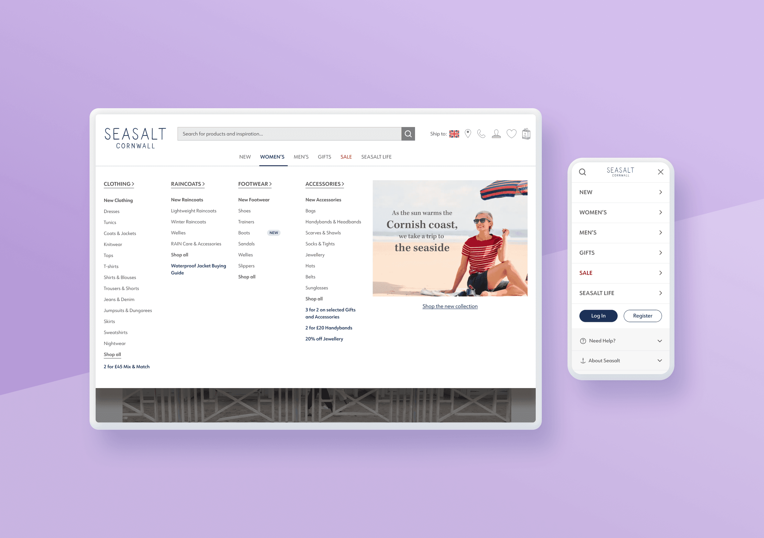
Sitemap
I created a shared Miro board with a visual sitemap with the new and existing category structure. Working with the Trade team and SEO Manager, we collaborated on the new menu structure.
Ideation & Design Process
Defining Requirements
We shaped the design goals by combining insights from user research and stakeholder input. This helped us align on the key objectives for the Seasalt website redesign. The recommendations focused on improving the usability and effectiveness of the megamenu by enhancing its layout, spacing, and visual hierarchy.
Key suggestions
These included expanding the megamenu to full width, refining the use of MMA space, and testing different design approaches for category promotion. Structural improvements involve using separate columns for sub-menus, increasing spacing for accessibility, and reducing redundancy in link terms. Additional enhancements include visual elements like dividers, distinct subheadings, and ‘New’ tags to highlight categories. These changes aim to create a clearer, more user-friendly navigation experience.
Ideas and Iterations
I guided the team to develop wireframes and designs based on our findings, which allowed for multiple options to be explored and gave team members a chance to contribute to the design process. We shared our ideas, reviewed them together, and discussed the pros and cons, deciding on which solutions to take forward for further mockups.
By combining the best elements of each design, I created several iterations for different types of navigation, categories, subcategories, links, and the default menu. These designs were first reviewed by the UX team and then by key stakeholders, including graphic designers, trade managers, developers, and product owners.
Feedback from the trade team helped us refine the placement of marketing sections, while input from the graphics team influenced font and styling for the marketing content.
Below are some iterations of the main menu I created:

Key Challenges
Some of the challenges in the design included:
Defining a style for category landing pages that included content, not just product listings, as not all categories had this feature.
Managing categories with varying numbers of subcategories and links, e.g., Women’s had 6 subcategories with over 50 links, while Men’s had just 3 with 16 links.
Handling a brand category that primarily featured branded content, such as the blog and sustainability.
Deciding between a desktop-down or mobile-up approach for tablet designs.
Presenting design options
In a design review session with stakeholders, I presented several variations of key features, both static and interactive, including:
Mobile header options, to decide between using the brand icon or full logo, and selecting icons to include.
Footer menu options with varying levels of links to promote key areas and encourage sign-ups and sign-ins.
Style options for category sections, experimenting with different backgrounds and fonts.
Subcategory options, deciding whether they should open in a new screen, appear as expandable on-page sections, or be fully exposed in the menu.
Megamenu design styles.
Each of these was discussed, and once decisions were made, I created the final designs.
Below are some of the variations presented to the team for discussion:


Prototyping
I progressed to creating interactive high-fidelity designs, reflecting the layout, labelling, and hierarchy choices. Designs were developed using both the current and new proposed menu structures, splitting out Men’s and Women’s categories.
Below is just a snapshot of the interactions within the menu:


Templates
A template for each menu structure, current and future, was created, along with fully designed categories populated with real content.


Ideation & Design Process
Defining Requirements
We shaped the design goals by combining insights from user research and stakeholder input. This helped us align on the key objectives for the Seasalt website redesign. The recommendations focused on improving the usability and effectiveness of the megamenu by enhancing its layout, spacing, and visual hierarchy.
Key suggestions
These included expanding the megamenu to full width, refining the use of MMA space, and testing different design approaches for category promotion. Structural improvements involve using separate columns for sub-menus, increasing spacing for accessibility, and reducing redundancy in link terms. Additional enhancements include visual elements like dividers, distinct subheadings, and ‘New’ tags to highlight categories. These changes aim to create a clearer, more user-friendly navigation experience.
Ideas and Iterations
I guided the team to develop wireframes and designs based on our findings, which allowed for multiple options to be explored and gave team members a chance to contribute to the design process. We shared our ideas, reviewed them together, and discussed the pros and cons, deciding on which solutions to take forward for further mockups.
By combining the best elements of each design, I created several iterations for different types of navigation, categories, subcategories, links, and the default menu. These designs were first reviewed by the UX team and then by key stakeholders, including graphic designers, trade managers, developers, and product owners.
Feedback from the trade team helped us refine the placement of marketing sections, while input from the graphics team influenced font and styling for the marketing content.
Below are some iterations of the main menu I created:
Key Challenges
Some of the challenges in the design included:
Defining a style for category landing pages that included content, not just product listings, as not all categories had this feature.
Managing categories with varying numbers of subcategories and links, e.g., Women’s had 6 subcategories with over 50 links, while Men’s had just 3 with 16 links.
Handling a brand category that primarily featured branded content, such as the blog and sustainability.
Deciding between a desktop-down or mobile-up approach for tablet designs.
Presenting design options
In a design review session with stakeholders, I presented several variations of key features, both static and interactive, including:
Mobile header options, to decide between using the brand icon or full logo, and selecting icons to include.
Footer menu options with varying levels of links to promote key areas and encourage sign-ups and sign-ins.
Style options for category sections, experimenting with different backgrounds and fonts.
Subcategory options, deciding whether they should open in a new screen, appear as expandable on-page sections, or be fully exposed in the menu.
Megamenu design styles.
Each of these was discussed, and once decisions were made, I created the final designs.
Below are some of the variations presented to the team for discussion:
Prototyping
I progressed to creating interactive high-fidelity designs, reflecting the layout, labelling, and hierarchy choices. Designs were developed using both the current and new proposed menu structures, splitting out Men’s and Women’s categories.
Below is just a snapshot of the interactions within the menu:
Templates
A template for each menu structure, current and future, was created, along with fully designed categories populated with real content.
Testing & Validation Usability Testing
Testing resources were limited at the time, so we focused on testing the new structure on mobile, where the changes were more noticeable.
The usability tests were moderated, with myself and the junior UX designer running the sessions. We invited stakeholders from different departments, including creative, copy, marketing, and trade, to observe the sessions. I really like having a range of people involved in the observation because it gives them a chance to see not only what we do but also how users really behave.
I worked with the junior designer to develop the usability test script. The main objectives were to evaluate the new structure and design. Since most changes were more noticeable on mobile, we made it the primary device for testing.
Methodology
Study Details Platform: UserZoom Go
Method: Moderated usability testing
Participants: Seasalt customers
Key Objectives Assess the usability of the redesigned menu. Understand if customers can easily navigate and locate key categories. Identify any pain points or areas for improvement.
Tasks:
Participants completed real-world tasks using a Figma prototype, such as:
Locating categories like new arrivals, dresses, raincoats, and petite clothing.
Finding information on sustainability and sales.
Using alternative navigation methods, such as search.
Moderators encouraged participants to think aloud while performing tasks to capture their expectations and frustrations.
Key Findings & Recommendations
Shop by Fit – Users found the term unclear and had different expectations. Some expected it under filters rather than as a standalone category. Recommendation: Rename to "Shop by Size" or "Shop by Body Fit" and adjust its placement in the menu.
Collections – The term was vague, with users expecting premium or seasonal products. The Men's section CTA was also unclear. Recommendation: Test alternative names like "Edits," "Featured," or "Trending Now" and clarify its navigation placement.
MMAs (Marketing Media Assets) – Users liked images but found duplicate CTAs and two-image layouts confusing. Recommendation: Avoid duplicate CTAs and test a single-image layout.
Gifts – Users preferred filtering by type, occasion, recipient, or budget, and some overlooked the dedicated Gifts section. Recommendation: Consider placing gift categories under "Women/Men" for better visibility and expand "Shop by Occasion" options.
Seasalt Life & About Us – The term "Seasalt Life" was unclear, and "About Us" was buried within it. Recommendation: Rename to "Seasalt Stories," "Our World," or "Blog," and move "About Us" to the main navigation.
Sustainability – Users struggled to find sustainability information and were confused by duplicate links. Recommendation: Place Sustainability under "About Us" and remove duplicate links to improve clarity.
Other Unclear Sections – Users misinterpreted "Seasalt Reskinned" and "Modern Creatives." Recommendation: Rename these sections for better understanding.
These findings were presented to the stakeholders, as well as the copy and marketing teams, since many of the findings revolved around Seasalt's terminology. Their input was invaluable in refining the language and ensuring that the terms used align with customer expectations and enhance overall clarity across the site.
Iterating based on findings
After initial user testing, I iterated on the design based on feedback. For example, I simplified some of the category labels. The final design included both desktop, tablet and mobile versions, ensuring that the navigation was optimized for various screen sizes.
Implementation
Once the design was validated, I worked closely with Seasalt’s development team to ensure seamless implementation, collaborating with the senior developer to bring the designs to life.
We also focused on ensuring the design was fully responsive across all devices, with particular attention to the mobile experience, as it caters to a large portion of the user base. Together, we defined interactions and functionality that couldn’t be fully captured in Figma.
In addition, I provided thorough Design QA across all devices to ensure the development matched the design specifications and met quality standards.
Final designs


Impact Performance Improvements
Considering the considerable design and functional changes made, particularly for mobile, we saw significant results, including:
Engagement Metrics Desktop: Hovering over top-level menu: +16.6 percentage point increase in the conversion rate of users viewing a PLP. Clicking into top-level menu: +18.4 percentage point increase in the conversion rate of users viewing a PLP.
Engagement Metrics Mobile: Engaging with the top-level menu: +10 percentage point increase in conversion rate for users viewing a PLP.
Increase in SEO Traffic: We’ve seen an increase in SEO traffic post-implementation, which indicates that the changes are benefiting the site’s visibility.
Qualitative Feedback Positive user feedback: Users have responded well to the changes, particularly with the new navigation structure.
Positive stakeholder feedback: Stakeholders are satisfied with the improvements, noting better clarity and user engagement with the menu.
Positive technical performance: After comparing performance data from two weeks before and two weeks following deployment, the results demonstrated significant improvements