Get Revising Study Planner App
Mobile and tablet app design for the most well loved tool, the Study Planner.
Role
Lead Designer
Industry
Education
Year
2016
Reflections
This project was one of the early ones in my career, focused on UI design. At the time, prototyping wasn't commonly used, and I relied on static designs informed by user research from a previous project. While this research provided valuable insights into user preferences, usability testing wasn’t part of the process, so the design wasn’t validated with users. Since then, I’ve made usability testing a core part of my workflow, ensuring designs are iteratively refined and validated at key stages. My approach has evolved significantly, with a stronger focus on user feedback and interactive prototypes that better showcase the user experience.
Overview
Problem Statement
The Get Revising Study Planner was one of the platform’s most popular tools, helping students effectively manage their study schedules. However, the existing desktop-based version relied on a multi-step wizard that was time-consuming and difficult to use on smaller screens, limiting its accessibility and overall user experience.
The Challenge
The desktop Study Planner featured a detailed, multi-step wizard that allowed students to create personalized study schedules. While effective, this process was lengthy and cumbersome, leading to user frustration. Additionally, since the planner had not been designed for mobile or tablet use, students struggled to engage with it on smaller screens.
Project Goal
The goal of this project was to transform the Study Planner into a mobile-friendly app that simplified the scheduling process while preserving its core functionality. By improving the user experience and ensuring the tool was easily accessible on mobile devices, we aimed to make studying more manageable for students on the go.
Key Objectives
Simplify and streamline the multi-step setup process for mobile users.
Maintain the planner’s ability to offer a personalized experience.
Ensure design consistency with Get Revising’s existing branding and website.
My Role
As the Lead Designer, I was responsible for adapting the planner’s functionality into a seamless mobile experience. I worked closely with developers and stakeholders to ensure the design met both user needs and business goals. My role included mapping user flows, creating wireframes, designing the UI, and conducting visual QA to ensure the final product was polished and user-friendly.
Personas & user journeys
Having previously worked on making the Get Revising website responsive, I was already familiar with the Study Planner’s limitations on smaller screens. To inform the mobile app design, I leveraged existing personas developed during the responsive project.
To map out different user journeys, I sketched initial workflows on a whiteboard before translating them into digital wireframes. This helped identify potential points of friction and opportunities to improve efficiency in the setup process.
Designs:
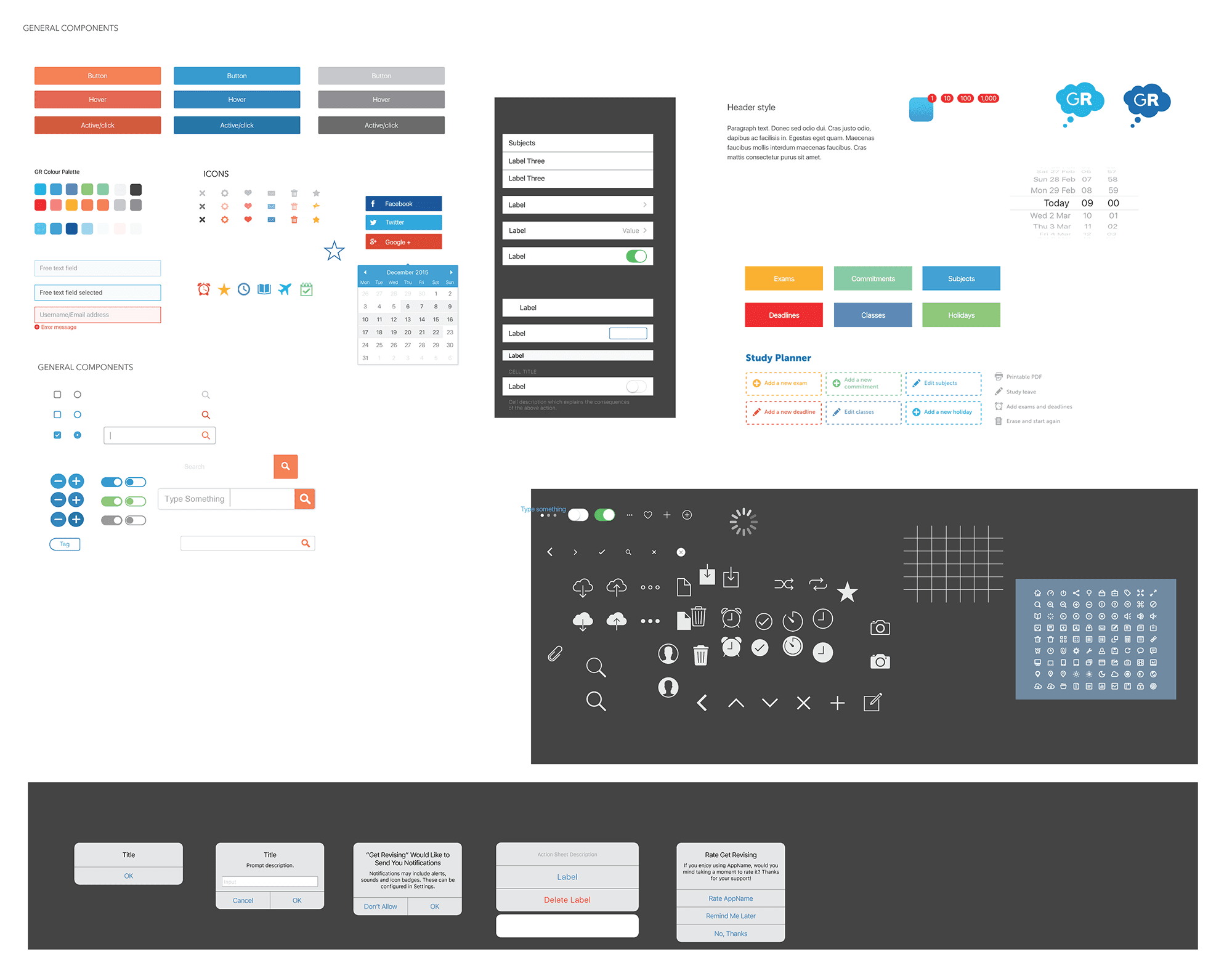
The desktop version of the Study Planner used different colours and icons to represent various session types. I carried this visual language over to the mobile app by incorporating the same colours into the setup screens and using the coloured icons within the planner to maintain consistency across platforms.
Using the wireframes and the new style guide I created for the Get Revising responsive site, I designed each key screen of the app. This provided a strong foundation for creating a seamless user experience.
User Engagement and Visual Appeal
Recognizing that the Study Planner is primarily composed of form fields, which can feel long and monotonous to users, I focused on making each screen as visually engaging as possible. By using bright, bold colours from the established palette and a clean, legible font, I aimed to enhance readability and user interaction. The goal was to reduce the likelihood of user drop-off by making the app feel more dynamic and approachable.
Designing for iOS
Given the limitations of static designs at the time and the iOS design guidelines, I used the default iOS design elements. The interface followed Apple's Human Interface Guidelines, ensuring a simple, intuitive layout with a grid-based structure. I opted for minimalistic icons and clear navigation to keep the experience straightforward and user-friendly.
Static Mockups
As interactive prototypes were not as widely accessible back then, I used static mockups to showcase the design. This allowed me to present a clear vision of the user flow and interface, ensuring the app’s functionality and aesthetic were effectively communicated.
Reflection on Accessibility and Colour Contrast
Looking back, now that I have a deeper understanding of accessibility and colour contrast, I would review and design the Study Planner app differently. I realize the importance of ensuring sufficient colour contrast to improve readability for users with visual impairments. If I were to redesign the app today, I would place greater emphasis on designing with accessibility in mind, considering contrast ratios and ensuring that all users, regardless of ability, can have a positive experience with the app.
Designs:
The desktop version of the Study Planner used different colours and icons to represent various session types. I carried this visual language over to the mobile app by incorporating the same colours into the setup screens and using the coloured icons within the planner to maintain consistency across platforms.
Using the wireframes and the new style guide I created for the Get Revising responsive site, I designed each key screen of the app. This provided a strong foundation for creating a seamless user experience.
User Engagement and Visual Appeal
Recognizing that the Study Planner is primarily composed of form fields, which can feel long and monotonous to users, I focused on making each screen as visually engaging as possible. By using bright, bold colours from the established palette and a clean, legible font, I aimed to enhance readability and user interaction. The goal was to reduce the likelihood of user drop-off by making the app feel more dynamic and approachable.
Designing for iOS
Given the limitations of static designs at the time and the iOS design guidelines, I used the default iOS design elements. The interface followed Apple's Human Interface Guidelines, ensuring a simple, intuitive layout with a grid-based structure. I opted for minimalistic icons and clear navigation to keep the experience straightforward and user-friendly.
Static Mockups
As interactive prototypes were not as widely accessible back then, I used static mockups to showcase the design. This allowed me to present a clear vision of the user flow and interface, ensuring the app’s functionality and aesthetic were effectively communicated.
Reflection on Accessibility and Colour Contrast
Looking back, now that I have a deeper understanding of accessibility and colour contrast, I would review and design the Study Planner app differently. I realize the importance of ensuring sufficient colour contrast to improve readability for users with visual impairments. If I were to redesign the app today, I would place greater emphasis on designing with accessibility in mind, considering contrast ratios and ensuring that all users, regardless of ability, can have a positive experience with the app.
Component Library
As part of the design process, I began developing a work-in-progress component library that drew on elements from the existing Get Revising style guide. The goal of this library was to ensure design consistency across the app and future-proof the development process by creating reusable components.
By aligning the mobile Study Planner with the established style guide, I ensured that the app maintained a consistent visual identity with the Get Revising platform, making it feel familiar to users. Key components in the library included:
Buttons: Standardized button styles with clear call-to-actions to guide users through the planner setup.
Forms: Simplified and mobile-optimised form elements to ensure a smooth, user-friendly experience when students input their schedules.
Icons: A set of recognisable, icons that tied in with the planner’s functionality, providing visual cues for session types and other important features.
Though the library was still in development, it laid a solid foundation for future updates to the Study Planner app and contributed to a more streamlined design process.
Designing the App Icon
A key part of the project was creating an app icon that was instantly recognisable, aligned with the Get Revising brand, and stood out on users’ home screens. Since the Study Planner was already a well-loved tool, I wanted the icon to feel familiar yet refreshed for the mobile experience.
Exploring Concepts
I started by sketching and experimenting with different design directions, focusing on concepts that reflected productivity, organisation, and ease of use. Some initial ideas included:
A calendar-style icon to represent planning and scheduling
A speech bubble to reflect community and conversation
A book or document to symbolise learning and support
A simplified version of the logos for strong brand recognition
Each concept had potential, but I needed to balance simplicity with recognisability, ensuring the icon remained clear even at small sizes.
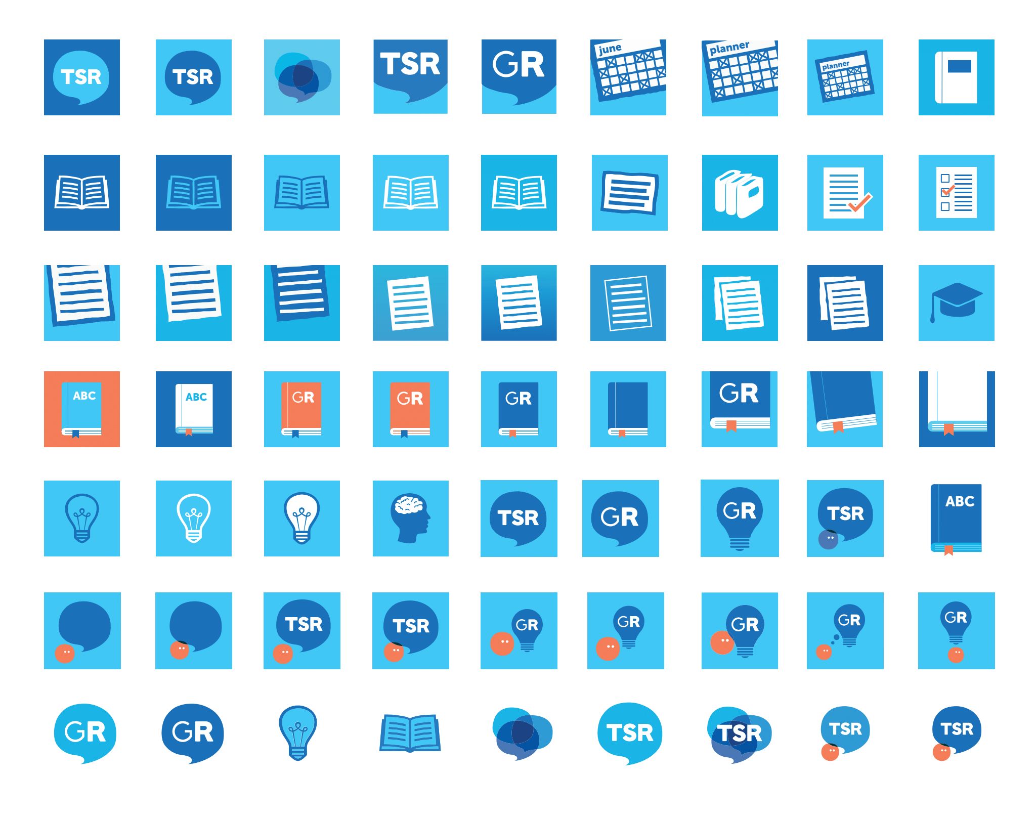
Refinement & Selection
After exploring multiple variations, I refined the designs by simplifying shapes, experimenting with colour, and ensuring the icons fit seamlessly with the app’s UI. The final decision was influenced by:
Brand Alignment: The icon needed to feel like an extension of Get Revising’s existing identity.
Clarity at Small Sizes: Ensuring the details remained sharp and legible on mobile screens.
User Recognition: The design needed to be immediately associated with studying and organisation.

Component Library
As part of the design process, I began developing a work-in-progress component library that drew on elements from the existing Get Revising style guide. The goal of this library was to ensure design consistency across the app and future-proof the development process by creating reusable components.
By aligning the mobile Study Planner with the established style guide, I ensured that the app maintained a consistent visual identity with the Get Revising platform, making it feel familiar to users. Key components in the library included:
Buttons: Standardized button styles with clear call-to-actions to guide users through the planner setup.
Forms: Simplified and mobile-optimised form elements to ensure a smooth, user-friendly experience when students input their schedules.
Icons: A set of recognisable, icons that tied in with the planner’s functionality, providing visual cues for session types and other important features.
Though the library was still in development, it laid a solid foundation for future updates to the Study Planner app and contributed to a more streamlined design process.
Designing the App Icon
A key part of the project was creating an app icon that was instantly recognisable, aligned with the Get Revising brand, and stood out on users’ home screens. Since the Study Planner was already a well-loved tool, I wanted the icon to feel familiar yet refreshed for the mobile experience.
Exploring Concepts
I started by sketching and experimenting with different design directions, focusing on concepts that reflected productivity, organisation, and ease of use. Some initial ideas included:
A calendar-style icon to represent planning and scheduling
A speech bubble to reflect community and conversation
A book or document to symbolise learning and support
A simplified version of the logos for strong brand recognition
Each concept had potential, but I needed to balance simplicity with recognisability, ensuring the icon remained clear even at small sizes.
Refinement & Selection
After exploring multiple variations, I refined the designs by simplifying shapes, experimenting with colour, and ensuring the icons fit seamlessly with the app’s UI. The final decision was influenced by:
Brand Alignment: The icon needed to feel like an extension of Get Revising’s existing identity.
Clarity at Small Sizes: Ensuring the details remained sharp and legible on mobile screens.
User Recognition: The design needed to be immediately associated with studying and organisation.
Project Phases
Phase 1: Setting Up the Planner
This case study focuses on Phase 1 of the Study Planner app, where the core functionality of setting up the planner was designed. Users could gather all the necessary information, such as exam dates, lesson timetables, work shifts, and social plans.
They could block out times they couldn’t study, pick a revision start date, and decide how much time to spend on each topic while scheduling breaks.
Phase 2: Displaying the Study Planner
Phase 2 focused on displaying the study planner within the app. The goal was to provide a clear, user-friendly interface where users could see their revision sessions, blocked-out times, and breaks. This phase aimed to help users track their progress and make adjustments as needed.
Project Pause and Transition
The project was paused before Phase 2 was completed, and I later left the company. As a result, the full app shown in this case study is incomplete. However, the design and foundational work from Phase 1 laid the groundwork for the app’s future development.
Outcome
The redesigned Study Planner aimed to deliver a more accessible and engaging experience for students, enabling them to plan their studies efficiently on mobile devices. However, as the project was paused before completion, the final app shown in this case study is not fully realised.
Key Results:
A more intuitive study planner with a streamlined setup process, though the full functionality was not fully implemented.
Enhanced usability through a visually engaging and user-friendly design, which laid the foundation for future phases of the project.
Final Thoughts
Designing the Study Planner app was a valuable learning experience, particularly in the early stages of my career. The challenge of simplifying complex workflows and creating a mobile-friendly experience shaped how I approach design today. I continue to apply these lessons in my work, ensuring usability testing and continuous refinement are central to my process.
View more projects
UX Design | User Research | E-Commerce
Optimising Seasalt’s Navigation & IA
Revamping User Experience Through Simplified Navigation and Improved Usability
UX Design | User Research | Community
Transforming Fuse: A UX Optimisation of Seasalt’s Intranet
Improving usability, engagement, and brand alignment to enhance the employee experience.
UX/UI Design | User Research | Charity
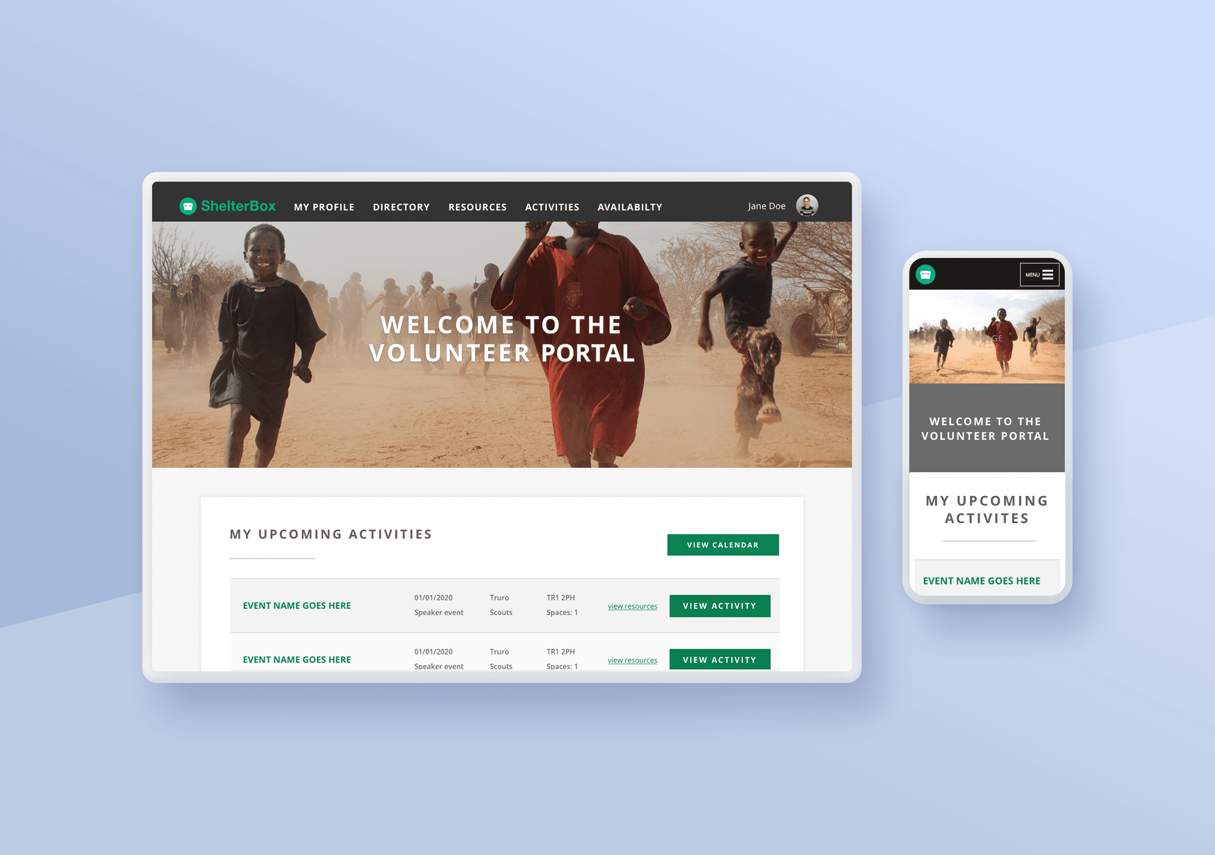
ShelterBox Volunteer Portal Redesign
Redesign of the volunteers portal taking a strong user led approach.
Load More
Load More
Load More
Copyright 2025 by LJ Hazzard
Copyright 2025 by LJ Hazzard
Copyright 2025 by LJ Hazzard